Developer Portfolio Header Section
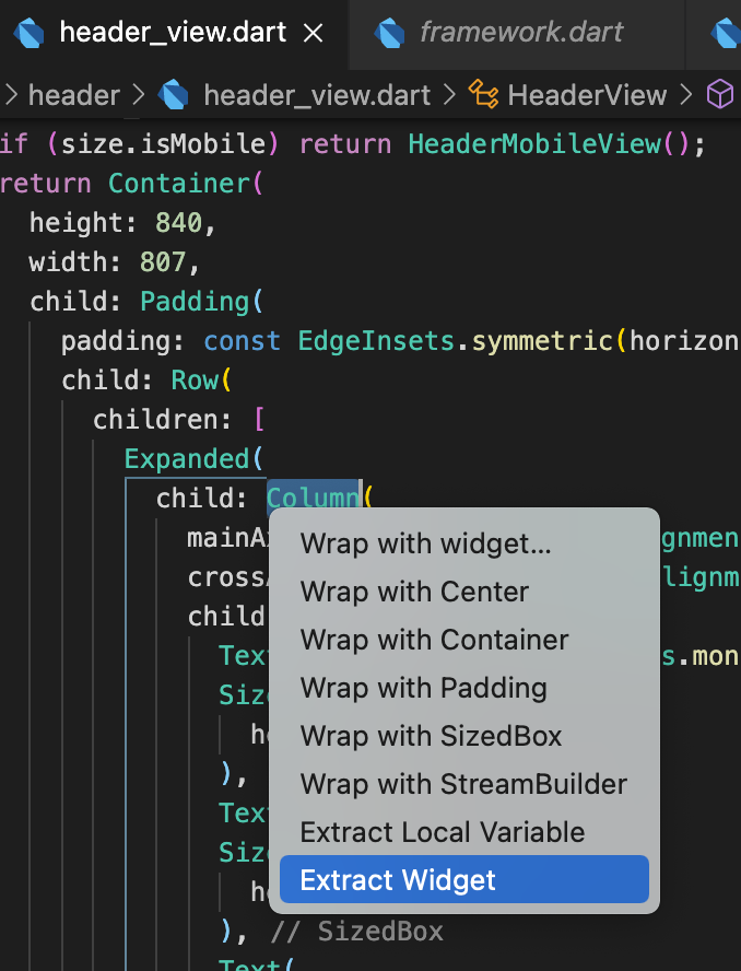
In the header_view.dart, under headerView, let’s extract the content. So the text, images, logo, etc.
All of that content is the Expanded child of the Row. let’s click on ‘Column’ of the Expanded child and Extract Widget
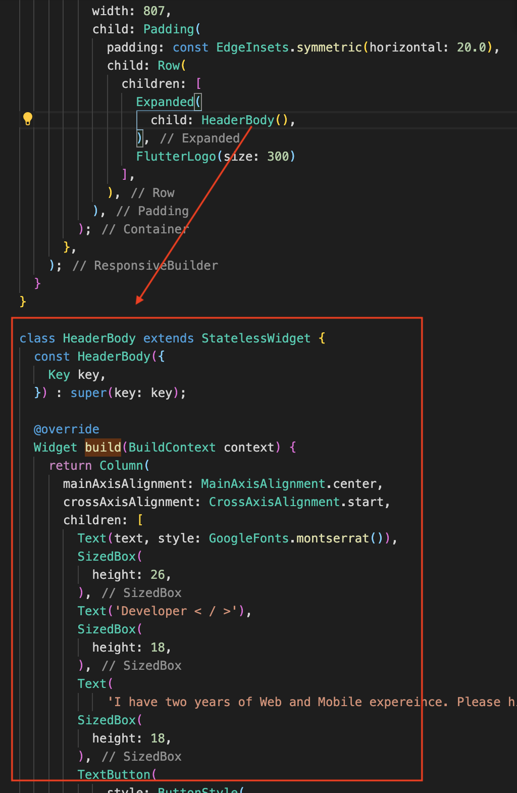
Then you’ll see that it has been extracted as the HeaderBody, and we instantiate it where our old code was. Notice that the logo is outside of our HeaderBody.
Now let’s put it inside our HeaderMobileView.
|
1 2 3 4 5 6 7 8 9 10 11 12 13 14 15 16 17 |
class HeaderMobileView extends StatelessWidget { const HeaderMobileView({ Key key, }) : super(key: key); @override Widget build(BuildContext context) { final width = MediaQuery.of(context).size.width; final height = MediaQuery.of(context).size.height; return Container( height: height * 0.9, width: width, child: HeaderBody(), // insert here ); } } |
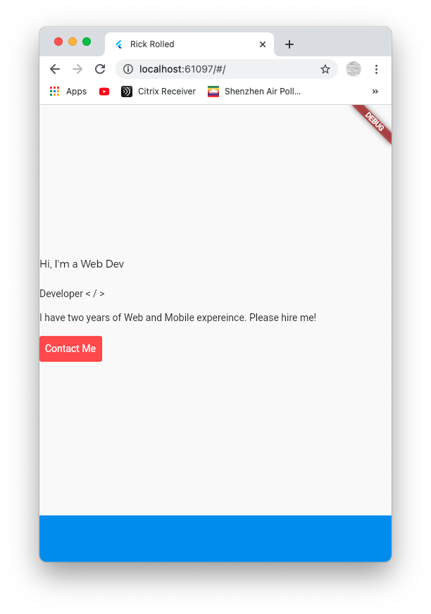
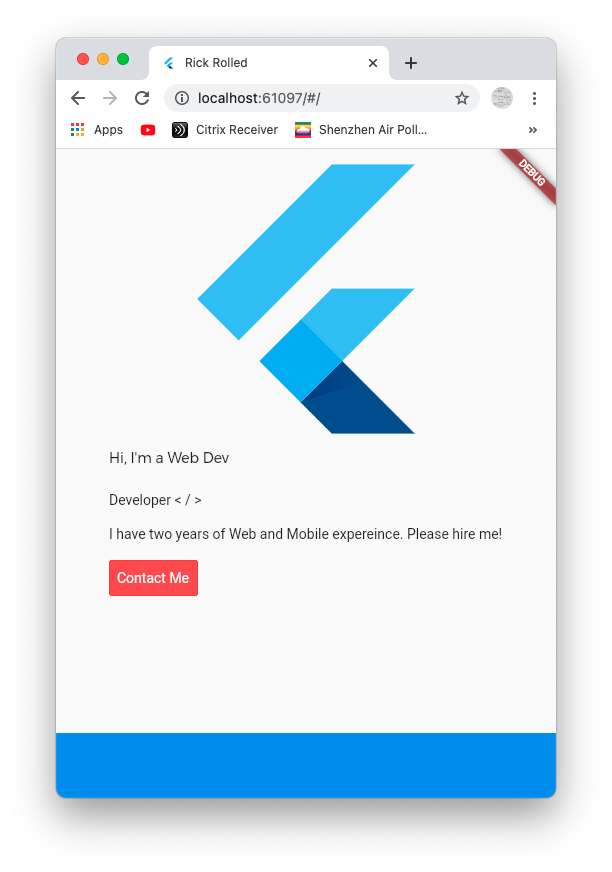
Now run the app, make it into mobile size and we see our header’s contents. Notice that our FlutterLogo is NOT shown because we did not include it in our HeaderBody.
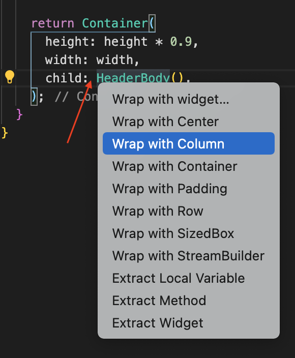
We need to add some padding, logo and what not. So we need to wrap our HeaderBody inside of a column. That way, we can add padding, put a logos, and what not as children.
The code should look like this:
|
1 2 3 4 5 6 7 8 9 10 11 12 13 14 15 16 17 18 19 20 21 22 |
class HeaderMobileView extends StatelessWidget { const HeaderMobileView({ Key key, }) : super(key: key); @override Widget build(BuildContext context) { final width = MediaQuery.of(context).size.width; final height = MediaQuery.of(context).size.height; return Container( height: height * 0.9, width: width, child: Column( children: [ FlutterLogo(size: 300), HeaderBody(), ], ), ); } } |
And now we see the logo in mobile view.
Now let’s add some padding.
Adding Auto Size Text
ref – https://pub.dev/packages/auto_size_text/install
Let’s add auto size text wdiget to our pubspec.yaml file. It is a Flutter widget that automatically resizes text to fit perfectly within its bounds. So say we specify that we want want our sentence to fit in two lines. Normally, when we start typing out the sentence, if it doesn’t fit, it’ll appear on line 2, then line 3. But with auto size text, the font size of the text will decrease so that it fits within two lines. And if we keep typing, and the widget sees that the text will start to overflow to line 3, it’ll decrease the font size some more so that our sentence will only fit in those two lines.
Installing auto size text
|
1 2 3 4 5 |
dependencies: responsive_builder: auto_size_text: ^2.1.0 css_colors: ^1.1.0 google_fonts: ^2.0.0 |
Flutter will then install it.
Once installed, let’s change Text to AutoSizeText like so:
|
1 2 3 4 5 6 7 |
AutoSizeText("Hi, I'm a Web Developer </>", style: GoogleFonts.montserrat(fontSize: 40), maxLines: 2), AutoSizeText('I have two years of Web and Mobile experience. Please hire me!', style: TextStyle(fontSize: 24), maxLines: 1), |
isMobile property
In HeaderBody, add property isMobile by cmd + dot.
|
1 2 3 4 5 6 |
class HeaderBody extends StatelessWidget { final bool isMobile; const HeaderBody({ Key key, this.isMobile, }) : super(key: key); |
Then let’s specify that whenever we’re on mobile, we give it a smaller font or size.
|
1 2 3 4 5 6 7 8 9 |
SizedBox( height: isMobile ?? false ? 9 : 18, ), EdgeInsets.symmetric( horizontal: isMobile ? 4.0 : 8.0, vertical: isMobile ? 5.0 : 10.0), TextStyle(fontSize: isMobile ? 8 : 14), |
In HeaderView, find the HeaderBody and pass in isMobile boolean from size object.
|
1 2 3 4 5 6 7 8 9 10 11 12 13 14 15 16 17 18 19 |
class HeaderView extends StatelessWidget { const HeaderView({ Key key, }) : super(key: key); @override Widget build(BuildContext context) { return ResponsiveBuilder( builder: (_, size) { if (size.isMobile) return HeaderMobileView(); ... .. .. Expanded( child: HeaderBody(isMobile: size.isMobile), ), FlutterLogo(size: 300) ... } |
In HeaderMobileView, since its a mobile view, let’s always give it a true value for HeaderBody
|
1 2 3 4 5 6 7 8 9 10 11 12 13 14 15 16 17 18 19 20 21 22 23 24 |
class HeaderMobileView extends StatelessWidget { const HeaderMobileView({ Key key, }) : super(key: key); @override Widget build(BuildContext context) { final width = MediaQuery.of(context).size.width; final height = MediaQuery.of(context).size.height; return Container( height: height * 0.9, width: width, padding: EdgeInsets.symmetric(horizontal: 20, vertical: 40), child: Column( children: [ FlutterLogo(size: height * 0.3), Spacer(), HeaderBody(isMobile: true), // always be true ], ), ); } } |